Massolit-Media.com
Description: Portfolio website
Platform: WordPress (PHP, CSS, HTML) hosted on an AWS EC2 Instance
Features: Custom post types and custom taxonomies managed by a plugin, custom index pages, dual header menus, responsive, mobile-friendly design, custom menu widgets, contact pages, custom metadata
I am proud of the first version of Massolit-Media.com. I even liked its “dark” theme. But I am not a graphic designer and there were too many fonts, too many colors. I was too rigid in my approach to some of the things I wanted for my site, as opposed to what I actually needed. Did I mention the site never had a search function? Nobody ever said anything critical to me about the website or its appearance, but maybe they just never said anything to my face.
When I entered a period of unemployment in early 2017, the website was more than three years old. I decided to recreate the website with the same concept and content, but on a different foundation. Three years is a long time, and it was a good opportunity to refresh my WordPress skills.
I created a new child theme from WordPress’s Twenty Seventeen default theme, a well-regarded, “business-focused” theme that was a huge leap forward from the Twenty Twelve theme that I had been using as my parent theme for Massolit-Media 1.0, “Profreshional.”
I started with Morten Rand-Hendriksen’s Lynda.com course “WordPress: Custom Post Types and Taxonomies.” This differed from the previous classes by Rand-Hendriksen that I had taken on Lynda. Once I started watching the class, I realized his approach to custom post types and taxonomies had evolved a lot since I last built my site. mor10 now demonstrated how to create your own plugin where you could add new post types and taxonomies to the plugin’s PHP. The advantage of this is that the new post types and taxonomies were not tied to your theme, but instead would now be available to the entire WordPress installation.


Because Rand-Hendriksen had already done all the work and I was just following along in Lynda, creating the plugin was quite simple. I called my own version “Taksys” – the root of “taxonomy” includes the Greek “taxis,” to arrange, so I just spelled it differently to make it sound more techy. (And when I Googled it, nobody appeared to be using the name.)
Next I went through the PHP template files I had created for my first child theme, and then recreated those template files in the new child theme as needed. This should have been a pretty easy process, but I had to do a lot of code review to see what does what, and how and why I had changed the original WordPress files. I began commenting the top of the file to say where the template came from, what purpose it fulfilled, and how (or at least where) I entered custom code. (This is something I should have done the first time.)

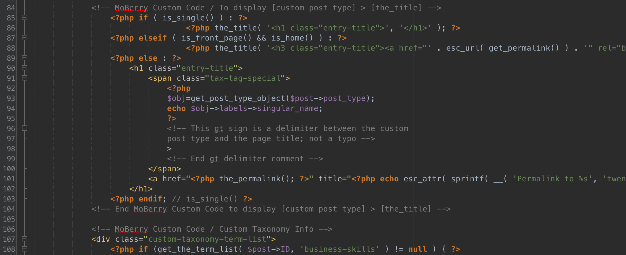
This was a good review of what I had previously built and why, but I was very confused and was having problems replicating a specific function that I really liked: when you click a linked custom taxonomy like Editing, you arrive on an archive template like this: https://www.massolit-media.com/editorial-skills/editing/. What I like about this page is before each piece of content, you see the content type and a greater than (>) symbol before the hyperlinked title of the custom post (for example, Website > Massolit-Media.com – Professional Portfolio Website):

Unfortunately, getting that Website > part in there was difficult. It kind of looks like something Mor10 left out of his later Lynda.com classes, so I had to use the code from my Profreshional child theme of Twenty Eleven in the taxonomy.php template. I was disappointed that I was not able to entirely understand what was going on, but it works. And I like it.
Now that all the PHP functionality had been added, it was time to do the CSS. My parent theme, Twenty Seventeen, is already fully responsive, and since I wasn’t customizing things like content widths as I did with Profreshional, there wan’t much to change. Again, I am not a graphic designer, so I decided to lift my fonts and colors from the U.S. Web Design System – my tax dollars at work. I picked my colors from their palette, and they only have two fonts (Source Sans Pro and Merriweather, both open-source fonts delivered by Google). The reduced number of components combined with Twenty Seventeen results in a cleaner look. Like the original version of the site, I also registered a second header menu.

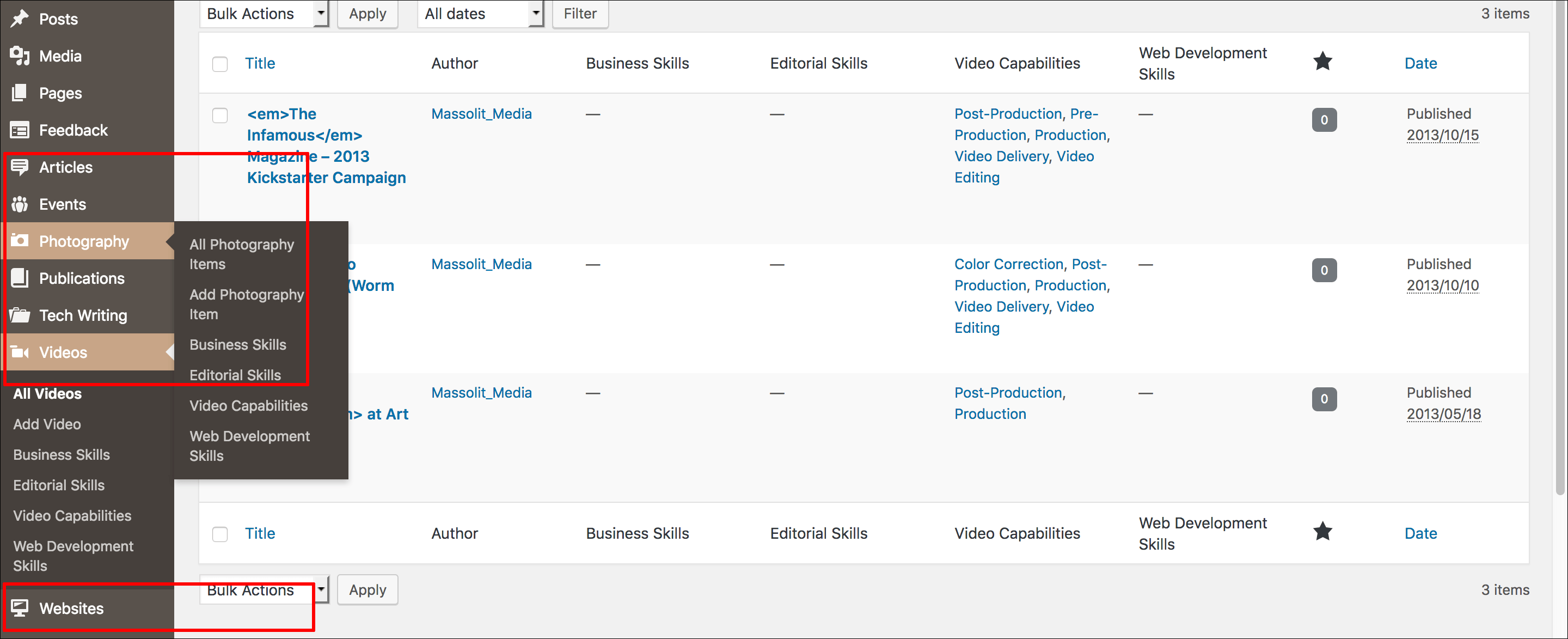
On the WordPress Admin section, I picked WordPress Dashicons to represent my custom post types by including the Dashicons in the Taksys plugin where I added the custom post types.

Not long after completing the new child theme, I was encouraged to move from my former hosting provider, GoDaddy, to Amazon Web Services. GoDaddy was OK for a small-timer like me, but the fact is the site was quite slow, especially when using wp-admin. AWS is much faster, cheaper, and it forces me to build my skills as a web professional. It also gives me topics to write about for technical writing samples.

